Silver mirrors.
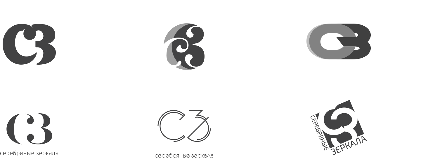
Old logo
It became obvious to the customer that, despite all the "fashionable" tricks, the old logo was outdated on all counts and required replacement.


Concept
The customer required that the logo would be a trademark consisting of the abbreviated company's name and an inscription below. The concept was based on several key principles that were supposed to characterize the brand: grace, simplicity, and ease of perception.
First sketches
We’ve taken into account the wishes of the customer and have prepared several options of the logo.
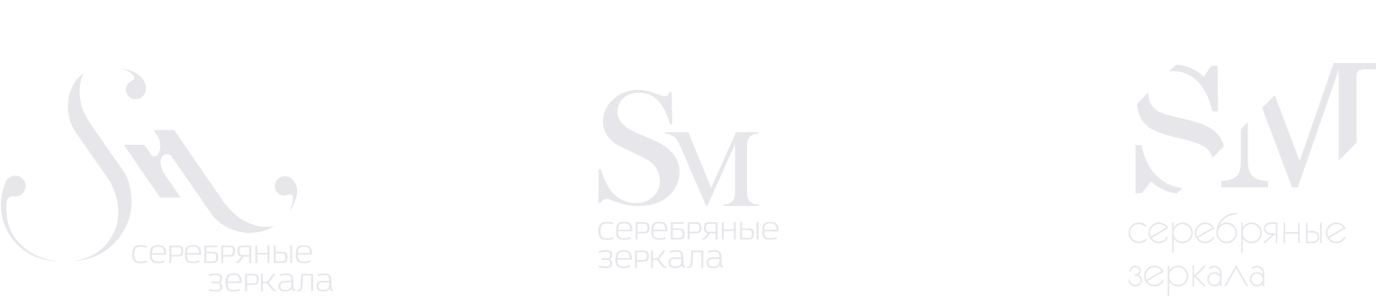
English version
The customer introduced some new requirements: since the company planned to enter the Western market, the logo should have been written using Latin alphabet. Therefore, we have developed several options to add to the new concept.
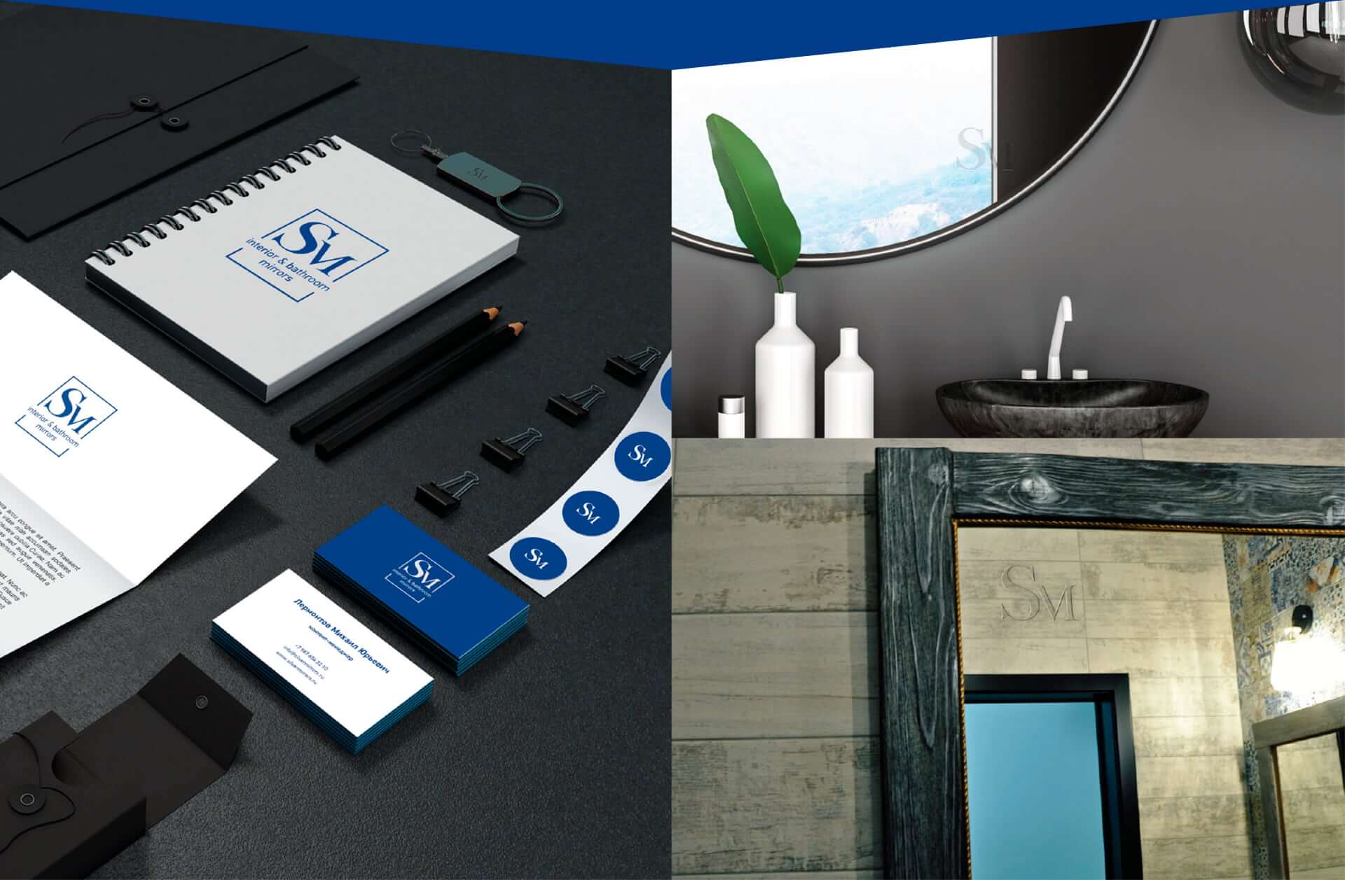
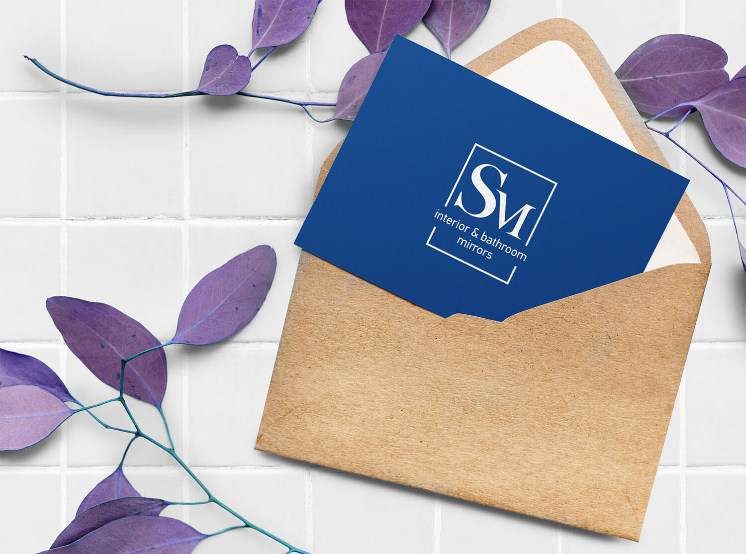
Final version

Tell us more about your project in just 60 seconds!
Tell us more about your project!