
Igrodar Online Store.

Task
Active expansion in various regions of Russia led to the need to create a modern online store that would meet urgent demands of the business and would boost development of the company.
It was necessary to simplify the purchasing process, to minimize the time between viewing a product and making a purchase.

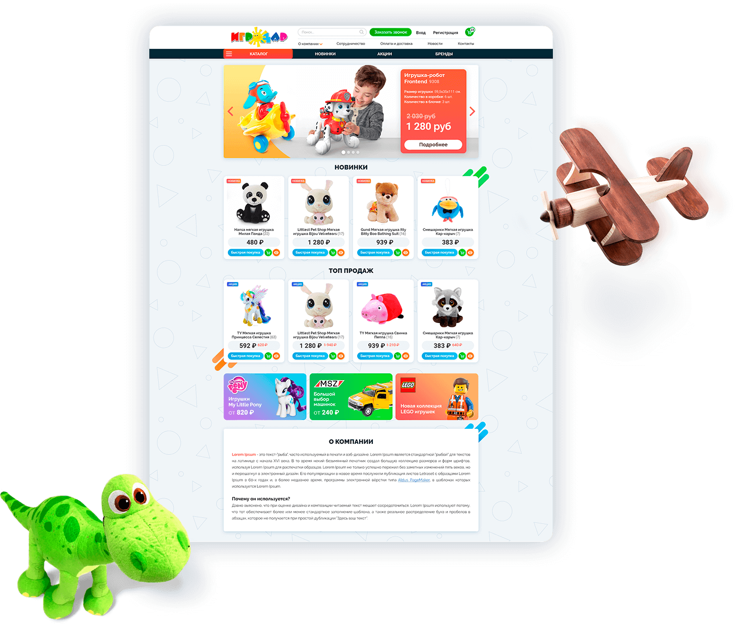
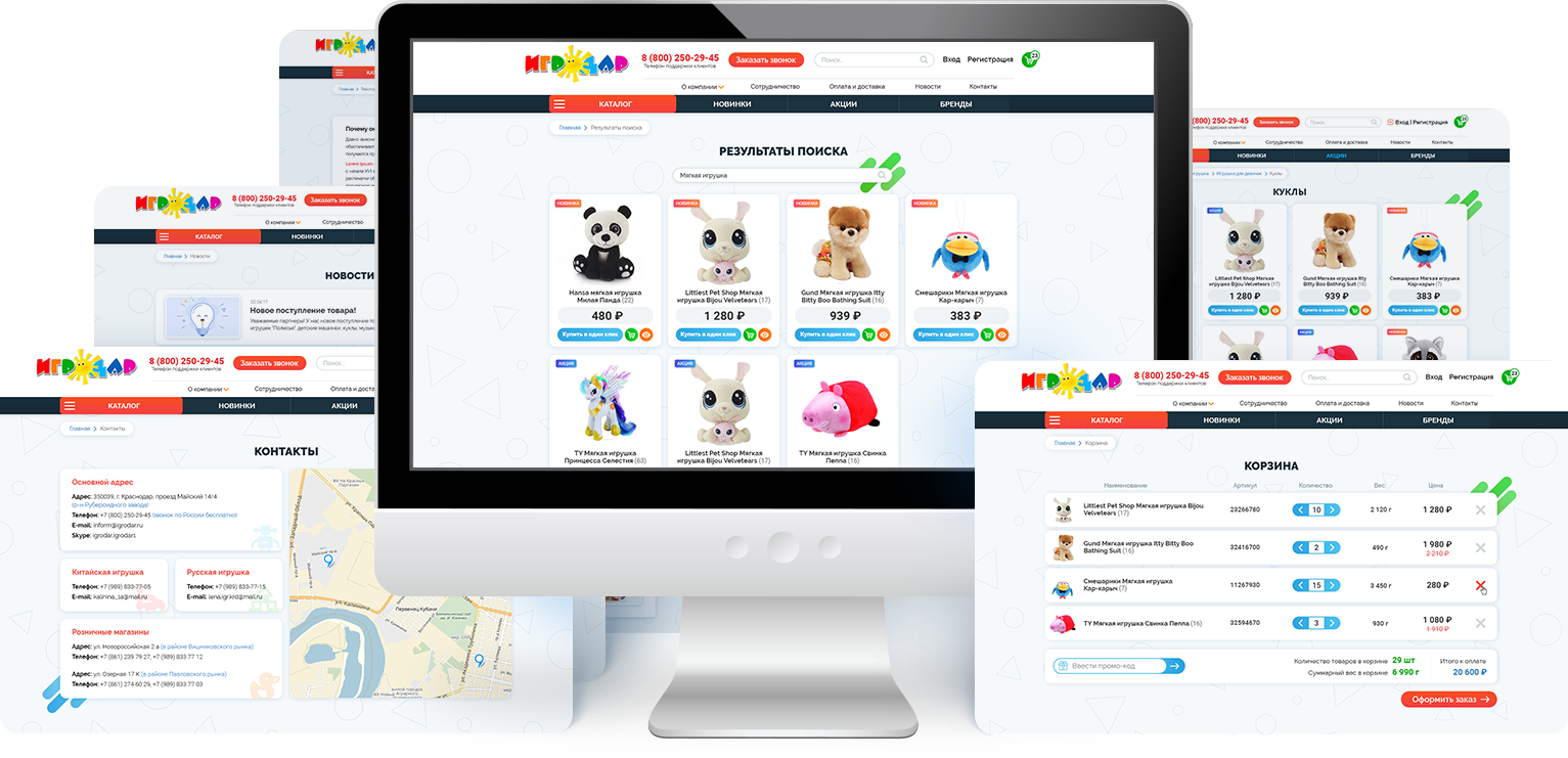
Homepage
The company had two major sales fields: wholesaling and retailing, which required implementation and combination of two main business models, B2B and B2C, and a non-standard approach to both development and design
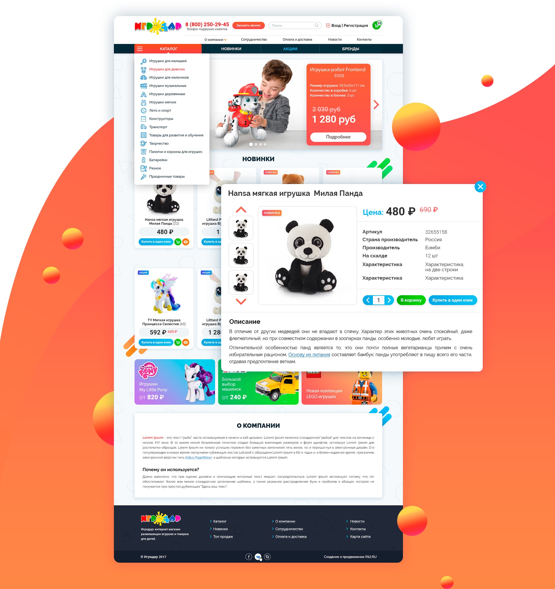
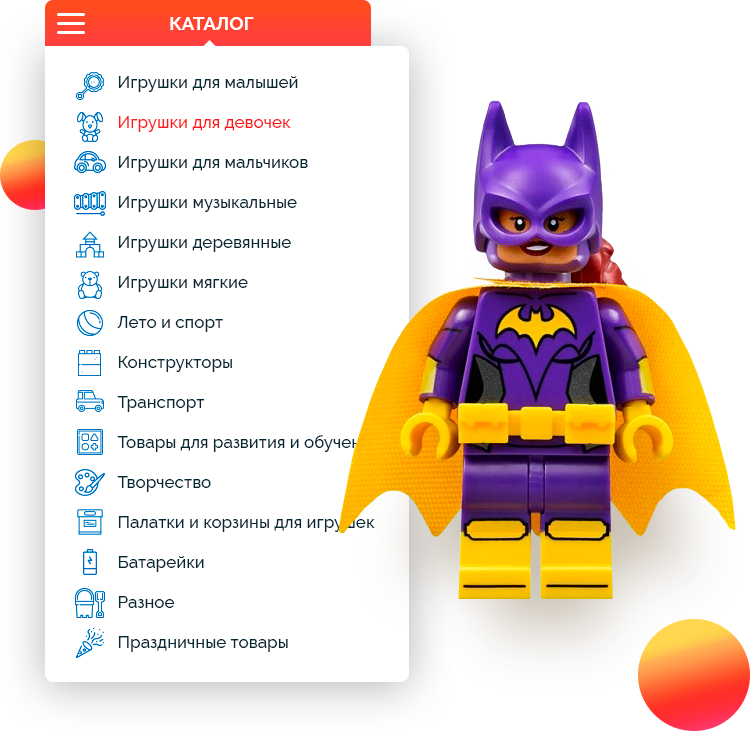
Catalog
A drop-down catalog with a list of categories for creative toys and products made it easy to find the required section.
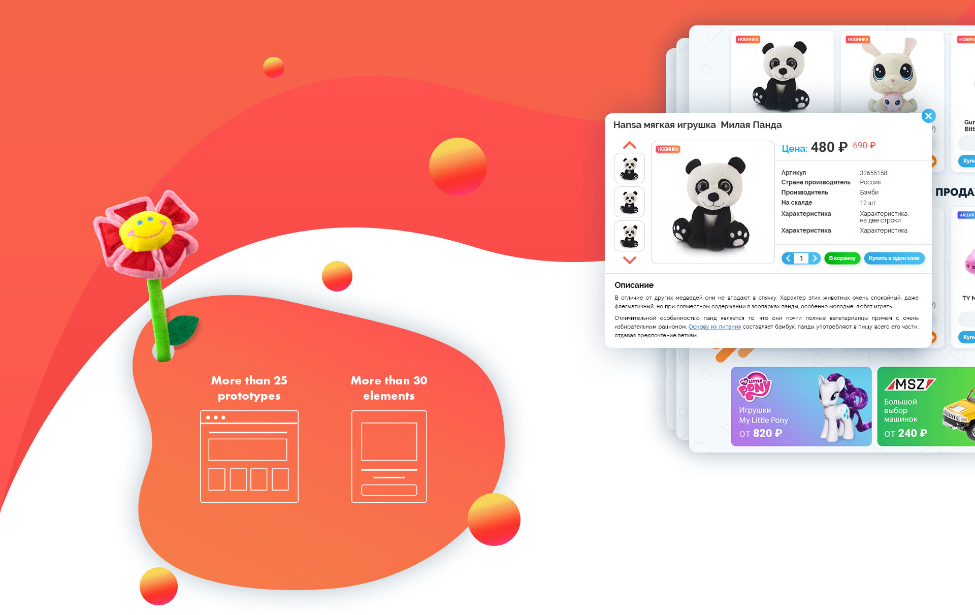
Important element
In the pop-up menu, all the main characteristics of the product were specified: photo, price, and available quantity in stock. The following icons were added for quick and easy navigation "Quick View", "Cart" and "One- Click Purchase."

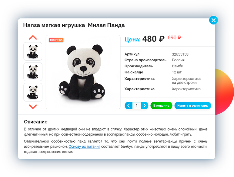
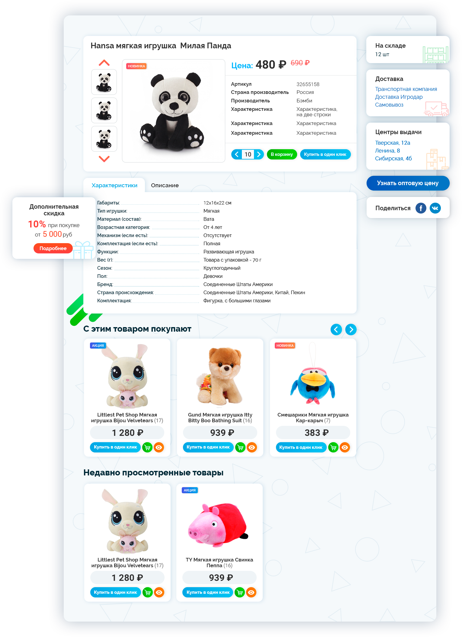
Product Card
The product card contains a maximum of useful information: price, manufacturer, sizes, description, and other characteristics. Photos in three projections allow viewing the toy from all sides. Information on availability of goods in the warehouse, delivery methods and distribution centers is displayed separately. All of the above allows the user to quickly make their choice and purchase.
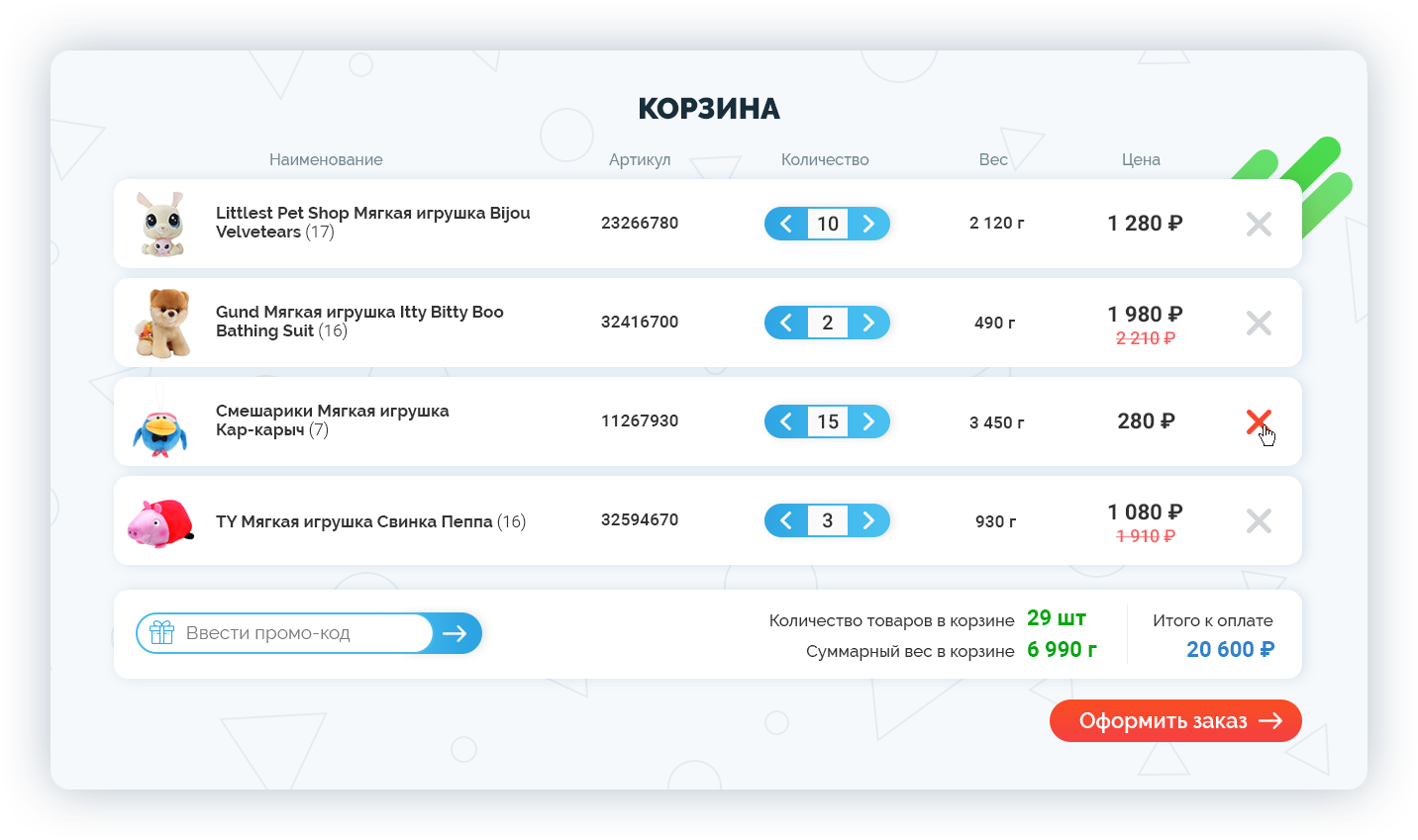
Shopping Cart
The shopping cart has all the necessary functions and characteristics for purchasing:
- a large photo;
- a noticeable price tag;
- indication of the available quantity of goods with the edit function;
- a promo code field;
- demonstration of applied promotions and discounts;
- Submit Order button;
- and the total cost of the order.
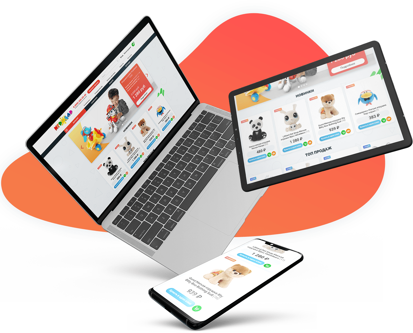
Adaptive version
The website has an adaptive version, making it convenient to view on smartphones and tablets. Creating an adaptive version was absolutely necessary, because currently, more than 65% of potential customers of the online store access it from mobile devices.

Word as Image
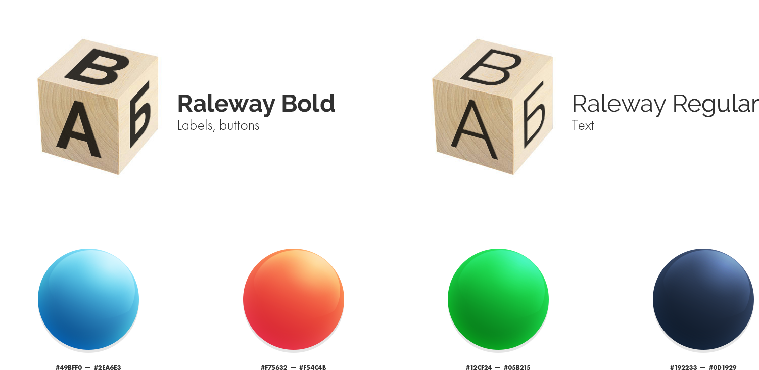
Unique Icons

What's inside?
The Igrodar website was created on the basis of 1C-Bitrix WebSite Management software using its Business version.

Internal Pages
The main page contains several sections of interest for users. The pages of these sections were drawn with great attention to detail, so as not to disrupt aesthetics and functional logic of the website. The screens for searching, registration and personal account, contacts and news were structured taking into account user experience and contained all the necessary information that was extremely user-friendly.
Tell us more about your project in just 60 seconds!
Tell us more about your project!